History Of The Album Cover
The first disc records, ones that we would recognize as such, appeared around 1910. Most often these were packaged in plain brown Paper or cardboard sleeves. Occasionally and enterprising retailer would print his store name on the sleeve but generally they were unadorned.

In the early 1920's retailers started gathering many of these cardboard sleeves and binding them together with heavy paperboard or leather covers. These looked similar to large photo albums and, borrowing the name, were sold as record albums. These albums offered much greater protection for the discs than the original packaging and were seen as indispensible to disc owners that had seen too many of their fragile records broken.

Beginning in the 1930s the record companies started using these record albums to distribute bundles of records from one performer or a collection of performers with similar musical styles. Some of the first cover designs can be traced to these albums and the record company’s desire to graphically communicate the music each album held.

Alex Steinweiss the art director for Columbia Records is given credit for the concept of modern cover art. He experimented with different concepts and images through the late 1930s and into the early 1940s. During this time Columbia Records rebounded from the terrible years they had suffered during the depression to become one of the most prominent record companies in the United States. Much of this was due to their ground breaking use of graphical design. (Of course signing Frank Sinatra may have helped a little too).By the close of the decade all major recording companies had graphic design professionals on staff.


The golden era of cover art design began in the early to mid 1960s and lasted into the early 1980s. During this time the major format for music was the 12 inch, long play disc or LP. Cover art became a part of the musical culture of the time. Often used to express graphically the musician’s artistic intent, it helped connect and communicate to listeners the message or underlying theme of the album.


As the medium for recording transitioned from the LP to the compact disc many graphic designers failed to transition with it. Having worked for so long with the much larger canvas of the LP cover, switching to the smaller CD case left most designers dissatisfied with their results. Often artist and record companies simply tried to shrink the LP size art to fit the CD.


Album cover art, now almost exclusively CD and CD packaging artwork, went through a period of change and rebirth in the 1990s. Designers learned to capture snapshots and portions of the artist’s musical intent rather than trying to convey the entire message. Also designers started conveying the emotion of the music rather than the musical intent.


In the late 90s computer design programs started to overcome the physical limitations of the smaller CD packaging. With the ability to draw much tighter, finer lines and have even small details look crisp and sharp, once again designers were free to explore a larger variety of design options. As the technology continued to improve graphic designers adapted and were once again producing world class artwork.


In the present, CD design is undergoing a true renaissance. Rather than becoming obsolete in the digital age as many thought it would, graphic design is once again proving itself as the difference maker. The internet is now the largest record store imaginable. Now rather than browsing a few hundred albums or songs at a time you may be exposed to thousands and thousands. Since it would be impossible to listen to portions of all those thousands of songs the design of the accompanying artwork must cause potential listeners to stop and take notice and give this album a try.


Album Cover Codes And Conventions
The following albums where taken from the site IGN for the 50 greatest album covers ever. for official site Click Here


This album follows the basic conventions of most albums covers, with the artists name the album tile and an image all located at the front. This os done as it waste to promote the artist, further more the name of the artist might be the deciding feature to someone buying the album. the image which is used is supposed to catch the attention of somebody just flicking through the albums, so in this case they used quite bright colours like red and pick to attract that attention. the album title is just to inform somebody who might what to know which one of the Marvin Gaye collection it is.
There are also various codes an subjective messages with in this album cover. the first one i see in with inn the typography of the album cover. The text is made from a mixture of curves and slightly sharper points this is to represent the sexual nature of one of marvin gays songs, as the curves are accosted with women and movement, and the shaper edges could then represent the sharper more passionate side of the sexual content in his album. The colours used for the text could also have meaning as the pink is quite a feminine colour, but then its almost blending in to red, which is also a more passionate colour representing love (in this case) and this tells you the sort of target audience for the album and the and the type of loves songs might be on it.
The image in the background also has a large amount of meaning behind it. add we look at the image we see that there is a lot of emotion in it. We see this by the blur in the arms which shows that the artist ids moving his arms very quickly. when we see the artist moving in this motion and with his eyes closed we subconsciously know that there is a lot of passion with in the way he is moving. this also translates to the type of music we will hear on the album.
Overall we can see that the albums target audience is likely to be young women and middle aged women.


The very bright and colourful third album is by the sex pistoles. this album is completely different to the previous two, in both colour scheme and the way its portrays its message. This album still follows the codes and conventions of the typical Digipack, but its a bit more forward with its message about what the track is about.
The simple purpose of this album cover is to, rebel and when somebody buys it people should know. this is the reason for the bright yellow colour, which will attract the attention of anyone passing by, either so they stop and by it or, to show the person who has bought it is a bit of a Controversial person or a "Rebel". This album could potentially be used a fashion icon.
The actual typography used is very interesting as its not very edgy like you would expect, its more striking and powerful, and looks quite formal like soothing you would find in a news paper heading. I think this has a better effect as it makes what they are saying "the Bollocks" look important either to them or for the audience. Then when you go to the "Sex Pistols" title the typeface changes to a more broken confused and fun text. this shows the more fun or crazy side to the band, the type face is a mixture Capitals and lower case latter which shows that they might not take then selves that seriously. Behind the text there is a neon pink strip, this could mean that the band it targeted a females as well as the rebellious boys.
The title of the Cover "NEVER MIND THE BOLLOCKS" is the most controversial aspect of this case as it was not a norm to have such profanity on the front of a CD which is sold in such public areas. this cased a lot of commotion around this album, despite having bad press about the album the simple fact is 'There is no bad Press' as people wanted to have it even more because because they wanted to look cool.
Overall the conventions of putting the album name and artist name are met, but they didn't put a recognisable graphic, in this case they didn't need to as all they needed to do was use the bright colour to attract attention. there are also various codes with in this which tell use they type of band which they are the genre of music. but subjectively the messages behind the cover are a lot more up front compared to the previous two.
The image in the background also has a large amount of meaning behind it. add we look at the image we see that there is a lot of emotion in it. We see this by the blur in the arms which shows that the artist ids moving his arms very quickly. when we see the artist moving in this motion and with his eyes closed we subconsciously know that there is a lot of passion with in the way he is moving. this also translates to the type of music we will hear on the album.
Overall we can see that the albums target audience is likely to be young women and middle aged women.
Much like the marvin gay album this also follows the Codes and conventions of the music covers. these are both in two different genres, this shows that the codes and conventions affect a wide range of the genres. despite their contrasting themes and musicality.
I think that this cover is a lot more striking than marvin Gaye's album. despite being a lot more simpler it first glance with its pail white background and simple typography. I think it has a lot more subjective meaning. The first difference we see in the typography is the colour of the text. this is a lot more subtle in its approach meaning its likely to have a wider target audience compared to the marvin Gaye album, and the music which is on the album does not have a reoccurring theme, of love in like "Marvin Gaye's album".
We also see that the text does not start with a capital letter. I think that this is a way of rebelling. Even though its only grammatically wrong it does have an effect, as naturally we would expect to see a capital letter on the title and the start of the artists name as they are both important key words and for simple grammar, but this adds a good effect as it shows that he is going against the norms and doing it his own way which was a large part of Hip-hop music as it informed empowerment with in the artist. One interesting aspect of the typography is that is changes at two key points. the first place it changes is where it says "BIG"and the colour black and red are added I think this is used to represent the darker side of the album contrasted against the innocent which background. The second time that we see the typography change is when it says "to die" this is very interesting as this slightly breaks the conventions. this is because usually when yo want to make a point as significant as this you would make it bolder that the rest of the text, but in this case the text is actually made smaller, which actually adds to clean and simplistic look of the cover.
The image used in this cover looks very simple and innocent which is a clever tool which has been used before like on they cover of the "Nirvana" album cover. These two albums both use babes to show the cruelty and negligence of the world. In biggies album the baby represents him. and the title says "to young to die" thus is vey obvious what the meaning of this is, as he is saying that in his eyes he's still a child, and if he was to die now he's lost the rest of his life to live. we see from this that biggie thinks of himself as being innocent which is to a common trait in the rapper life style, this almost makes people look at him in a different light which essentially breaks the inventions of "Hip-Hop" album cover.
The simple purpose of this album cover is to, rebel and when somebody buys it people should know. this is the reason for the bright yellow colour, which will attract the attention of anyone passing by, either so they stop and by it or, to show the person who has bought it is a bit of a Controversial person or a "Rebel". This album could potentially be used a fashion icon.
The actual typography used is very interesting as its not very edgy like you would expect, its more striking and powerful, and looks quite formal like soothing you would find in a news paper heading. I think this has a better effect as it makes what they are saying "the Bollocks" look important either to them or for the audience. Then when you go to the "Sex Pistols" title the typeface changes to a more broken confused and fun text. this shows the more fun or crazy side to the band, the type face is a mixture Capitals and lower case latter which shows that they might not take then selves that seriously. Behind the text there is a neon pink strip, this could mean that the band it targeted a females as well as the rebellious boys.
The title of the Cover "NEVER MIND THE BOLLOCKS" is the most controversial aspect of this case as it was not a norm to have such profanity on the front of a CD which is sold in such public areas. this cased a lot of commotion around this album, despite having bad press about the album the simple fact is 'There is no bad Press' as people wanted to have it even more because because they wanted to look cool.
Overall the conventions of putting the album name and artist name are met, but they didn't put a recognisable graphic, in this case they didn't need to as all they needed to do was use the bright colour to attract attention. there are also various codes with in this which tell use they type of band which they are the genre of music. but subjectively the messages behind the cover are a lot more up front compared to the previous two.
Album Cover: Existing Product Research
For this research task, I looked at existing physical products which were available in shops. this gave me a more realistic out look on the expectations of the actually Digipack, instead of looking on the internet. this also allowed me to have a different out look on the products as I could actually feel them and look at them in more detail. overall this would help me in my own task as I will have a greater understanding on whats on the market and how other artists and companies have designed their cases. This in turn will either inspire me or show me in a greater depth how some of the codes and conventions are used.
The six CD's which I looked at where:
- Black box recorder By Passionoia
- You could have it so much better By Franz Ferdinand
- Rockferry By Duffy
- Here be monster By Ed Harcourt
- The smell of our wn By The Hidden Camera
- The hour of Bewilderbeast By Badly Drawn Boy
 To start of with I looked at the front covers of each of the six cases which I had, and looked at what was on the It. I found that all six of the covers had an image, this is expected as this a is a large part of the CD conventions. All of the covers had all the artists names or the bands name on the front, as this might be a crucial selling point for the artists. This is because when some people by CD's are sold because the artists them selves have a huge fan base even though the music might not be that good. Both of these points are basic conventions of the CD's and actually expected. on of the conventions was broken which was the album title.
Only four of the CD's had the album title on them and this is surprising as this is the third expected convention of the CD covers.
The album by Franz Ferdinand and The Hidden Cameras also didn't have the artist image on them, meaning that there is also a bit of a trend on the albums. the two albums are also ver simplest as well so this might just be the look that they where going for and they wanted to reduce the clutter at the front.

The back of the cover had a lot more features and varied a lot more between the CD's. Only one of the CD's had the album title at the back, which is expected as its usually on the front and on the
spine so its not necessary to have it on the back as well.
Furthermore there where no artist names on any on the backs, simply for the same reason as the album name. Five of the covers had images at the back. The reason for this is because they are trying to follow a certain theme and they usually follow this to the back so it looks more unified, and this helps the aesthetics of the CD and if people see it from the back first, it should still be eye catching.
 Only two of the albums had the artists image at
the back, but these where not that vivid or didn't stand out that much, and this might because they didm really want to be the centre point of the cover but they still wanted recognition on the CD. All six of the CD cases had the track list on the back. This isn't that surprising as this is a common convention of CD cases to have this on the back. This is because it allows people to see what songs are on the CD without opening the cases, this both speeds up the process of looking at the song either in the shop or at home, plus it means that the CD is less likely to get damaged during this process as its not exposed, as if the track list was on the inside. Only one of the CD cases had the track length on the back which was "The smell of our own" by Hidden Cameras. This convention is usually hit and miss as some CD cover choses to have it where as some just don't, it really depends on what the designers prefer.
The next convention which I expected to see at the back of all the six CD cases where the record labels. When I looked at the cases I found tat this convention was followed by all six. This is because the cases are also used as an advertising technique for both the artists and the record label. It is very unlikely that there will be a CD case without the record lanes name o it, this is either in the small print or their logo.
The spine of the CD cases are very simple, as they are not that important, depending on how they are displayed. If they are stored in a minor where you you can only see the spine, they are key so you can see what CD your are picking out. but usually they are not the focal point of the CD case. On the spine you usually the the Artists name and album title. This convention was followed by all of the cases, but its usually just these's two thing for convenience and because there isn't that much room on the side to fit anything else. The side spine usually mirrors the outside spine following the same conventions.
The inside from cover is usually a lot more simple compared to the rest. the front usually has a small insert or booklet with information on it. This usually doles at the front and fort insider cover. As expected they all had this inside. five of the covers had images on the from inside, the only one which didn't was the album BY Duffy. This simply had the artists name on it in white on a black background. Above this was some small credits. Only "the Hour Of Bewilderbeast" CD case, had the track list on it as they all already had it on the back. but the track list was done is slightly different stye to follow the theme of the insert. this might have been done incase you wanted to keep the insert/booklet separate. The artist name was only in one case and and the album name was only in two, this is because its most likely already appeared both at the front and at the spine so if it was there again it would just me repeating itself.
This is the same for the back inside where I found only two back inside had an image, this was mainly because the Cd would be covering it so there was really no need, and this was a growing teen on the inside as most of the conventions where not really needed. thebans Photo and credits only appeared once and so did the band name all for the same reason as they are not real necessary here and the Cd world be covering them the majority of the time.
Codes in CD Digi-packs
Below is the analysis of an album by J.P Harris and the Tough. the images below show my analysis of the messages coded with in this album. This will help me in making my CD Digi-pack as I will understand what sorts codes and conventions i could use, further more from this i have to make the codes very obvious and almost stereotypical so they are easy to decode and the audience can quickly understand them.


Existing Chance the rappers CD Cases

With in the two previous albums there are
trends which I have to decide to follow or not as they show a development of
the artists and his work. The trends almost act as a trade mark of chance the
rapper and this is what his audience would Know him to be like and how they love him.
Changing the style of the album could be risky, as it would change the artist
identity or image and I would have to be very careful how I approach it as the
audience might not like, a new way of presenting Chance.


Planning Template
In preparation for making my own Digipack I had to make a template. This will allow me to create the images within this template. By doing this I will ensure that I do not put the images upside down in the Digipack or confuse the order which they appear in. Before creating this i searched if there where any online which I could use.
I found a template which provided the template in Photoshop format which would allow me to go in to it and edit the template, I then saved this for future use.
Planning Fonts
In planning for what fonts to use for the album cover and the magazine title for the artists name, I looked at some already made fonts on a website called Dafont click here for the link to the website.
the website allowed you to view a range of already made fonts, arranged in different categories.
this site made is easier to find the sort of fonts which I wanted as I would instantly know which ones would look good as it showed a preview of what the text looked like.
To use the font you clicked on a category, and searched for the one you wanted within that catagory.
In the screen shot below, it shows how the choices appear. for this example I will use Skygge as a font. click on download.

Once you have downloaded the file you will have to locate it and then install it.


The font will then appear in the Word or Photoshop application you you are using.

The only down side to this some dots will to work, and will appear as normal format. As shown below with this particular font, it is the last one on the list. On the other hand a large amount of them do work like the ones shown above, the Skygge.
Once I have all the fonts which I like, I will then ask the potential target audience which ones they prefer, and this will then influence the one which I will use on the CD digipack and the magazine.
When I had all the fonts I wanted I created a small table to go along side with the fonts, this would allow me to ask the audience which top three fonts they liked and mark it down in the table. At the end of this I will collate the data to see which are the most popular fonts.
The images below show the fonts and table


I asked 31 students who where in the demographic which I was targeting, it was essential I asked the right people as if not the product might not be properly tailored to the right people therefore the target audience might not purchase the product. overall there where a total of 93 votes as each person voted for their top three.


From the results I found that font 15 which was "Hacked" was the most popular with 16 votes out of 93, this was most likely to be top of the list of fonts which I was going to use. There was a general trends as the fonts which where the most popular where thicker fonts, like the second font "College" with 12 votes overall. these two fonts where very different as hacked was a much sharper but futuristic font, whereas college was and American style college football text. Although the second one was very popular I will not likely be using this as, this album does not relate to this font, as this was his topic from his last album and in my design I want to show that he has developed as an artist instead of sticking with the same look and feel as he did with his first EP which he actually wrote in high school.
The image below is of the second most popular, but this I will not be using it.

The third most popular font was number 12, titled "Good morning Good afternoon" with a total of 11 votes. this font was also one of the thicker fonts. supporting that the target audience liked this thicker bolder fonts to the thinner sharper fonts.
From these results I have decided to pick three main fonts which I wall test during the making process of the Digipack cover and magazine to see which would be the most effective. The first font which I will use is "Hacked" as this was the audiences favourite.

The second font which I will take forward is "Good morning Good afternoon" as this was the third most popular font chosen by the target audience.

The final font which I will go with is one which I have picked and believe has the most potential and best represents the artist and his type of music. this font might be a risk as this wasn't even following the trends set by the data but, I believe that this font could potentially stem the rest of the Digipack and magazine advertisements.

Design Brief
Due to the stylized method of rapping which chance the
rapper does, it would be expected by his audience to follow this trend, and
create more unorthodox magazine covers and digi-packs. This means that it is
likely that I will avoid using a normal image or portrait to represent chance.
I feel that the image will have to stand out from the rest of the promotional
materials, in shops and online, to create a successful marketing scheme. The
image I am using will have to be quite artistic or graphic, and show the wild
side of chance the rapper and represent his acid rap form. I have had ideas of
using patterns to illustrate the artist, and this could link to some of the
titles, which I have chosen to follow up. Another idea was to turn the artist
into a cartoon.
The key to these being successful is for the as
advertisements for the artist, is for the images to clearly identify the
artist, as this will be the key focal point of promoting the artist. The images,
which I use, will likely be extreme close-ups so that I can fully portray the
emotion on the artist’s face on both the digi-pack and the magazine advertisements.


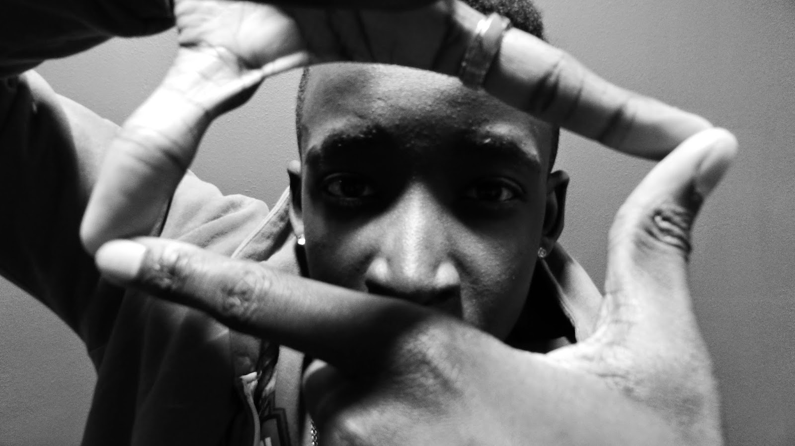


Photo-shoot 1
This was the first service of photo-shoots for the CD Digipack. These photos where more close up's
as I wanted to get the artists recognition, and profile up. This meant that it was key that the artist was recognisable and clear meanwhile maintaining the cool and rap profile.
The photos which I would then like to develop would be the Black and white photos and the ones with the Movement, as these give the artist a more serious and professional look. The images also present more emotion and subjective views, compared to the initial shots which where taken, as they where rather bland and weak.
CD Digipack Photoshop
Below is an idea of how I could manipulate some of the images which I got from the photo-shoot. I added a new layer on top of the images and then traced the original image with a black paint brush.

I then deleted the original image and then added a preloaded image behind the traced drawing.

I then proceded to rubbing out the coloured background, I would just meet the image of the artist.


I then did the same to the next image, but then I did not remove the original image so it gave it a slightly carbonised look.


This could be a potential effect which I could use in the CD digipack.


CD Inside back cover
Below is an idea which I had for the inside of the digipack where the cd will site.
I am planning to develop this idea and instead of him looking through a rectangle he will be looking through a circle, so this will then link this image to the circular shape of the CD. buy changing the shape in to a circle will also allow me to change the aspect ration, and it will be easier to fit in to a Square.
I have added the paint brush effect like previously, but just on the inside of the frame, to give it a greater effect.
below was the same idea, but with a different image and inn negative, this does liik very unique and i think this actually suites the artists music very well but it is harder to identify the artist properly which takes away the purpose on me using the close up of him.
Front cover ideas.
The first idea which I had was.
The movement action shot photograph. This is shown below.


The movement action shot photograph. This is shown below.
My second favoured effect on the image is the two layer, Back and white then inversion effect. This effect also has the movement on top, the only downside to this Is that the artist himself isn't that clear, but if the target audience like it it would be one worth considering.
Audience feedback
To find out which image I should used use for my CD Digipack I designed a questionnaire, to hand out to the target audience. This questionnaire contained some of my favourite and most successful photos, and I asked them to pick their top three favourite for the cover of the Digipack.
The design is shown below.
Below are some images of the target audience filling in the questionnaire.

I ensured that the target audience where bombarded with the images at once and gave them a short amour of time to fill the questionnaire in. This meant that the one which stood out to them the most was the one which they picked, therefor determining the one which they would look at first if they where quickly looking through their albums. This also allowed me to see which image had the best imprecation on then at this quick glance, therefor they will be likely be to remember it for longer.
Overall I asked 20 members of my target audience.
The Images for the background for the digi-pack are shown below. These where taken from the original survey.

Original image below

This was the most popular photograph voted for by the target audience with 16 of the 20 people said this was in their top three photographs which they would like to see as the background for there CD Digi-pack. This image is very good as it has all the mise-en-scence needed to correctly represent the genre of music this is and this easily translate to the audience. This is because of the snap back hat, Gold chain, and Hoody which the subject is wearing. These are very stereotypical of rap artist as they like to show their wealth with the gold chain, and are commonly associated with the Snap back hats on backwards which is also another fashion accessory which chance the rapper ears excessively.
 The image also has they characteristics associated with this genre as the subject has a very serious face, and his head is slightly slanted to the left which shows attitude, this shows a very different personality compared to the previous chance the rapper album when he was still in high school. This image is slightly more grown up and shows progression in his music. (His ten day cover is to the right). the most popular part of the photograph was the waving gads effect in front of the subjects face. This was done by Titus rapidly waving his hands in front of his face, this allowed me to capture the movement of the gads in front of his face, meanwhile still being able to blearily see his face, which was in my specifications for the cover- That the artist must be clearly identifiable- much like his previous covers as he is still an emerging artist and he needs the promotion.
Before in his previous covers he had the mesmerised/lost/confused face looking up towards the sky or directly to the camera, like he was using drugs. I have adapted this concept and had him wave his hands in front of his face, as this gives a slight blurred effect like something his distorting his view, or his face id being distorted from our view, which essential gives the same effect.
Because of its overwhelming results from the public feedback this is the image which I am most likely to use for the digipack.

Original image Below

The image above was the second most popular, to use as the background for the CD Digipack.
Overall this image had 14 votes out of 20 as one of the top three to be used for the digipack. This image had a coloured version, whereas this was taken in black and white. This had a much greater reception as this has a more sophisticated, and protectional look. unlike the previous TiTus is not looking directly at the camera much like the 10 days album. but we can see the he is looking at something, and the place which he is looking is darker and he is praying towards that direction. this image has a lot more subject meaning to it which would make the audience think bout the image and the meaning of the album a lot more.
The lightest section of the image is his face this highlights him and attracts attention to him making him more identifiable, a key characterise which I am looking for, in the CD Digi-pack. this image isn't as aggressive as most Hip-Hop albums which is why it might have foot a good reaction as its slightly more unique. On the other hand it does then lack the obvious characteristics associated with chance the rapper and his style of psychedelic acid type rapping and his key accessory of the snapback. despite this it is a very key contender for the front cover of the CD digipack.

Original image Below


Out of the top three this had the least with 9 votes, therefor out of the three, this will be the one I am least likely to use on the front cover but if needed it could be used on the inside, or back.
There are two versions of this image one with the artist eyes closed presented to the left of the original. the original shows the artist clearly and does represent the artist clearly and his genre, but its very generic and does not really stand out from the crowed. The version with his eye closed does show a bit more thought as it raises a few more subject meanings. This makes the audience look at the cd cover for longer wondering why his eyes are closed, and then they would look at the rest of the Digi-pack.


The image still looked incomplete as the black ink didn't have much of a striking effect and was almost lost in the image, I then inverted the image and produced the images below, as it turned the text back and then the black ink white, which presented a much bolder statement.


Front cover Design ideas
The front cover is supposed to have the artist on it this was the first specification which I had to comply with. this was just an obvious fact as this was to promote the artist swell as he was still un known, furthermore this complied with a the conventions os a lot of CD designs.
The first idea which I had was loosely based on the disclosure CD cover which is shown below.
I wanted to use the same sort of effect but much ruffed and less defined, as I believe that my artist album has more of an edge to it compared to the disclosure album.
To start I used the second most favoured image as it was easier and more likely to produce a much better looking image from This. I started by getting the image which was already in black and white from the Photo-shoot and drawing on it using the graphic pads with a black ink pen.
the images of this first process are shown below.
I then Added The fonts to the Cover, I decided to add the artist name at the side of the image using the vertical type tool, as there was not that much space around the image to put the name.
The image still looked incomplete as the black ink didn't have much of a striking effect and was almost lost in the image, I then inverted the image and produced the images below, as it turned the text back and then the black ink white, which presented a much bolder statement.
The following three below are the finished covers with the parental advisory added and with the three potential fonts. the parental advisory sticker is also slightly see through as I have increased the opacity as the original was to harsh and distracted the audience from the main image.
The second idea which I had used the same effects as the previous but with a different image and the added ink on top was much cleaner and slick. The image is shown below. Also this image is not as powerful as the one before it has more codes in it to inform us on what genre the artist is with the snapback hat and the chains are still visible.
On this cover the font is actually white as it does not get lost into the back ground as it did when it was black.
From the results of these first two ideas I prefer the Wicked text much more as it looked a lot cleaner and more unconventional. This font has an edge to it which the others don't as its so simple.
For the first idea I chose to go a completely different direction. As the artist wasn't completely identifiable in the first two. this lead me to make one where you could see his face a lot more.
I used the favoured image by the audience feedback, cropped it and turned it black and white.
Using the hue tool I darkened the image so it has a more mysterious look, as the first black and white image was to bright was lacking in contrast.
I chose to add the Wicked text to this one as this is the final font which I will use for the CD Digi-pack as it describes chance the rappers music best because of its simplicity and purity, with a little bit of edge which is shown in the font.
Below is the first attempt of the finished front cover, with the parental advisor sticker on it.
This is another version of the digi-pack with a black banner behind the text as this will highlight the name of the artist much better as the are conflicting colours.
This image was fine to use as the front cover but I felt that it was still boring and did not reflect chance the rapper personality. I believe that the cover needed some colour and chance the rapper is usually represented with the colour purple so this would be essential that I include this somewhere in the cover, This will allow him to keep this identity which he is associated with by his fans and target audience.
Below is the completed front cover with a colour gradient added on top.
This version of the front cover was much better in terms of better representing the artist, as it brought in a bit more colour which represents the artist personality better. this would also be beneficial marketing wise for the Digi-pack as it would be more visible amongst other CD cases.
Inside cover idea
For the inside of the Digi-pack I would like to use an image of the artist for the background but i also want to incorporate some of the artist lyrics in to the cover. One idea which I had was to do a text rap of the artist image, meaning that the artist face would be made from words.
To do this I used one of the images which I took in the first photo-shoot. Because I had already completed a survey on the most popular images to use on the digi-pack I already had a selection of the top three. I chose to use the third most favourite image which is shown below, for the initial design of the inside cover.

I first had to cut the section which I wanted from the image which was the body and face without the background. i used magnetic lasso tool to do this section as i felt it was the quickest and easiest method for me.

I then added a black layer beneath is and merged them together and saved this new layers displacement.
The finished displacement image is shown below.

I chose to use one of chance the rappers most popular songs Cocoa butter Kisses for the text. i could simply copy and past this of the internet and in to photoshop. i added a text box above the image as a new layer and pasted the text in. I highlighted the text and put it in to abaci MT, made the text size 12, smooth and then changed the character length space to 10 so the characters are close enough to create a clear image.

The results of this where actually very pleasing and I believe that this on its own could be used as the inside cover without the text wrapping effect being added. This was one design I could consider.

Once I had the text I wanted where I wanted it, I as then able to mover to the next step. This was going to the filter tab, click on the distort button where then it will allow you to choose the displacement effect. This is shown below. by doing this effect it will allow me to wrap the text around the face.

Another screen then appeared, I made the horizontal and vertical scaling both 5. the displacement map was stretch to fit and for the undefined ares to repeat edge pixels. I then clicked OK and the desktop appeared. I selected the displacement image which I had saved earlier.

The image below sows the text as its wrapped around the picture. instantly the text conforms to the contours of the face.

I Then changed the blend mode to overlay

This produced the image below. This image is actually fine on its own to be used as a background, but its very bland and does not represent chance the rapper as well as possible. But this was another option to consider for the inside front cover.

to make the image a bit more personalised to chance the rapper i needed to add some sort of colour, and one colour which he is famous for sporting is purple, because of its acid rap and psychedelic relation.
To do this I clicked on the adjustment layer button and selected gradient. then went to the layers and selected the gradient layer. which is the top layer in the image below. then changed the blend mode to colour.

Once I double-clicked the gradient layer thumbnail a new tab popped up which allied me to change the colours of the image, it had presets which I could choose from, but I decided to create my own by clicking on the stop tabs and going in to colour then selecting my own colours from a palette. I then played with the settings, by changing smoothness and intensity and blend from purple to black and white, until I got the result I wanted.

The finished image is shown below.

Back cover ideas
I have sketched out quickly the four potential concepts for the Back cover of the CD divi pack.
I will develop these and show the more successful ones to the target market to get some feedback on which one I should do.
The first idea which I have is to have the the song title, then next to it have the first line of the song. this almost gives then a little snip of the content of the songs. The actual song will be highlighted in some form either by underlining it or in a different colour.

The second concept which I have is to position the text on the right hand side of the back, although this is very simple, it does brake some conventions used, on digi-packs. This makes the person reading then think about it slightly more and in some cases make them feel uncomfortable when reading it, which will create a reaction which is what I want from the design.

The third concept is a text wrap of the track list on to the artist hands while he is covering his face. This creates a direct link with the front cover there the artist is waving his hands in from t of his face. this then also create s a link with the inside cove with the use of text wrap. Overall its creating a sense of uniform within the digipack making it look neater and more professional.

The fourth concept is for me to get an image of the artist with a black background and remove his eyes and nose, then I will replace these with the track list. This still links to the idea of his vision being blurred or him being confused.

Concept Building
The first concept which I completed was the fourth. This was where the eyes and the mouth of the artist where removed, the the text was put in place of them. This idea reflects the ideas behind the front cover, where I am going to use the image of the artist waving his hands in front of his face. these images both support the artist vision being blurred, or being confused. This is overall creating a more uniformed front and back cover.
This image is using the same methods of design as the inside front cover. With the displace meant image and the text being wrapped on to the image. I have also incorporated the black and white effect plus the purple, used in the inside front, to create a link between the images. Over all this will give it a more professional look.

The second image which I completed was the first concept where I would, use the track list and then the first verse or part of the first verse of the track to make the foreground. In this I have also used a the purple fading in to black gradient effect as a background, this links it to the inside front cover as the colours match and the heavy use of text. The number for the tracks are made more visible , by using larger and purple font colour, because the text is so busy it would be very difficult to locate the tracks.
The image below can still be used for the inside back cover where the the CD would go, this would mean that the digipack would have a heavy focus on the lyrics within the music, and from the lyric analysis of some of his songs I find that they have a really heavy message which would be beneficial to his artistry if I pointed some of them out.

The third concept which I completed was concept three, this was where the artist held his had over his face and the track list would be placed on top. This concept was done with the same technique as the first concept which I had completed with the displacement and colour gradient.
in this version I decided to mix the purple with some green and this had positive effect, but I did not feel that this look was right for the back cover. Over all I liked this image, as it continued the theme of the digipack but I felt that it was not right for the overall look of the digipack.
I decided not to use the second concept as it was not original enough, or quirky enough to represent chance the rappers, style and personality.
Second Photo-shoot
This was the second photo-shoot for the digipack. These photos where likely to be used on the inside back where the CD would actually go. For this section I had the idea of using tituses hands in a circular shape to identify where the cd would actually go.


After taking these images I decided that I would not use them as they didn't look they way I had envisioned them and, and seeing this physical evidence of what they might look like on the actual CD divi-pack I felt it would actually degrade the aesthetics and simplicity of the Digi-pack.
Completed Digipack
The starting template for the digi-pack is shown below, with all the guidelines needed to create the Digi-pack.

Because I had already made the different sections of the digi-pack in different files all I had to do was copy and paste these in tot the template and adjust them to the correct size. While doing this I had to be carful, as I had to rotate the template so I Could get the inside section the right way round.

Next I inserted the barcodes on to the back sections of the digipack, and this was keeping in line with the conventions of digi-packs. This meant that when scanning the digipack upon purchase it would be easy to find. Another reason why this is a good place to put this was because I didn't want it to disrupt the image at the front, as this was where people would judge the digi-pack on when they first see it.
I then inserted the logos. because chance the rapper is not signed to any label I put on his personal logo which you see on his clothing or his websites. I then also inserted the logos for the studios which he recorded the album in so they get some recognition, as if they where record labels.

I had to invert the Classick studios logo as this was not visible, by doing this it also made it match with the other logos which where on the back.

For the spine I just simply inserted a black bar as I wanted to keep this section simple. This section was where the name of the album was going to go, and also another chance the rapper logo.

Using the same font as I did fore the artist name on the front cover (to keep the design uniform) I added the album name using a Vertical Type Tool. I then used the colour dip tool to pick the colour of the text on the front cover. This allowed me to make sure that the two matched and looked uniformed.

I duplicated the chance the rapper logo and then placed the new layer on the spine. This allows people to see that its a chance the rapper product when looking at the side of the digi-pack depending on how its displayed in the stores. This also mean I will not have to put the artist full name on the side as this will make the spine very cramped.

To complete the back cover I inserted the small print with the certificates and the copyright information of the artist and the record labels.

Below is the completed back cover with the album title above the track list. I used the same font and colour for this text to match the rest of the main titles used in the digi-pack.

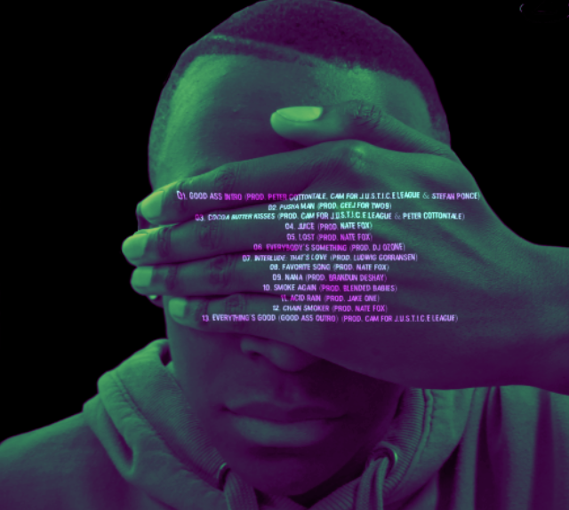
On the inside front cover where there are song lyrics in the image, I also put the name of the song as a title using the same font and colour as the rest of the major titles. The song which is there is cocoa butter kisses as this is one of his most popular and meaningful songs chance has released.
The completed CD digipack is shown below.


The general theme of the digipack is very dark and simple, this has become a trend with artist like big Sean a Hiphop artist, with his album dark sky paradise.
.png)
This album cover is very dark and its difficult to see the artist, I wanted this dark feel to the album but then I had to relate it back to the artist and his music which is why it has the purple shade added on top. I decided to keep the parental advisory on the front cover to warn people the the album has explicit content which is legally required, but I decided to meet it central so it is more predominant, this actually breaks the codes of may album covers as the sign is usually on one of the corners. I wanted to break the conventions as I wanted, the audience feel that there is something unique o the design of the cover even if they did not see it straight away, it would still make then think that something was different, I they way that this cover was designed and this reflects to the artist as wall as he is not a traditional rapper and he likes to express himself in more quirky ways.
I am very pleased with the front cover as it presents all the codes relevant to portraying Chance the rapper as a 'rapper' taking away from the fact its in his name. I have ensure that the audience is still able to see the artists Snapback, and if you look carefully you are still able to see the chain on his neck.
The general theme of the artist been on drugs is kept but it is very suttle. This is because I wanted to ensure that the message of the digipack was not that this whole album was dedicated to the drug use. I did this by using the image of the artist waving his hands in front of his face, this meant that there was a slight blurred effect and the artist would not e able to see properly and is slightly confused, and this works for the audience swell as we can't fully see the artist (but he is still identifiable), which are some of the side effects of drug use. I took this ideology on to the back cover swell, but made it slightly more morbid as I completely removed his eyes, so it has more of a subjective meaning of using drugs can make you lose sight of whats actually happening or what your doing.
On the two inside covers I have made it clear that I want the audience to focus on the message which chance the rapper is saying in his music by using lyrics as part of the design on both the inside covers. doing this actually breaks the conventions of digipack as they usually have information on the artist or credits on the inside front, But chance is very innovative in his music and I wanted to do something different as his audience would expect. I have used song Cocoa Butter kisses on the inside front as this is one of his most popular songs as they lyrics in it are really are hitting and personal to the artist.